


Challenge
This brand was going to be an offshoot of an existing brand within the client’s parent company. Therefore they wanted the brand to be distinctive enough to recognise as being a new entity but also borrow some of the parent company’s DNA in order to retain some of its existing brand equity. It was also going to be challenging to create a brand that would stand out from a very competitive furniture market.


Solution
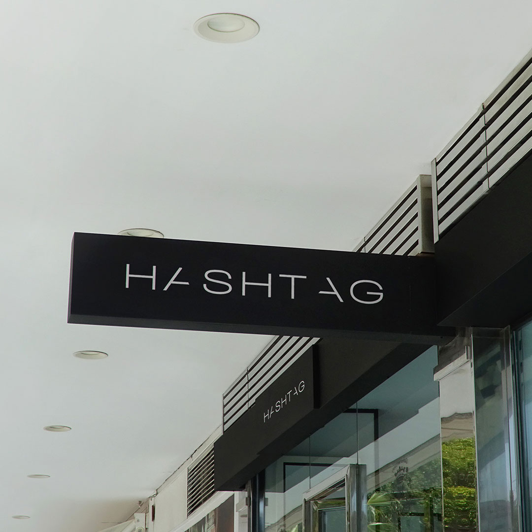
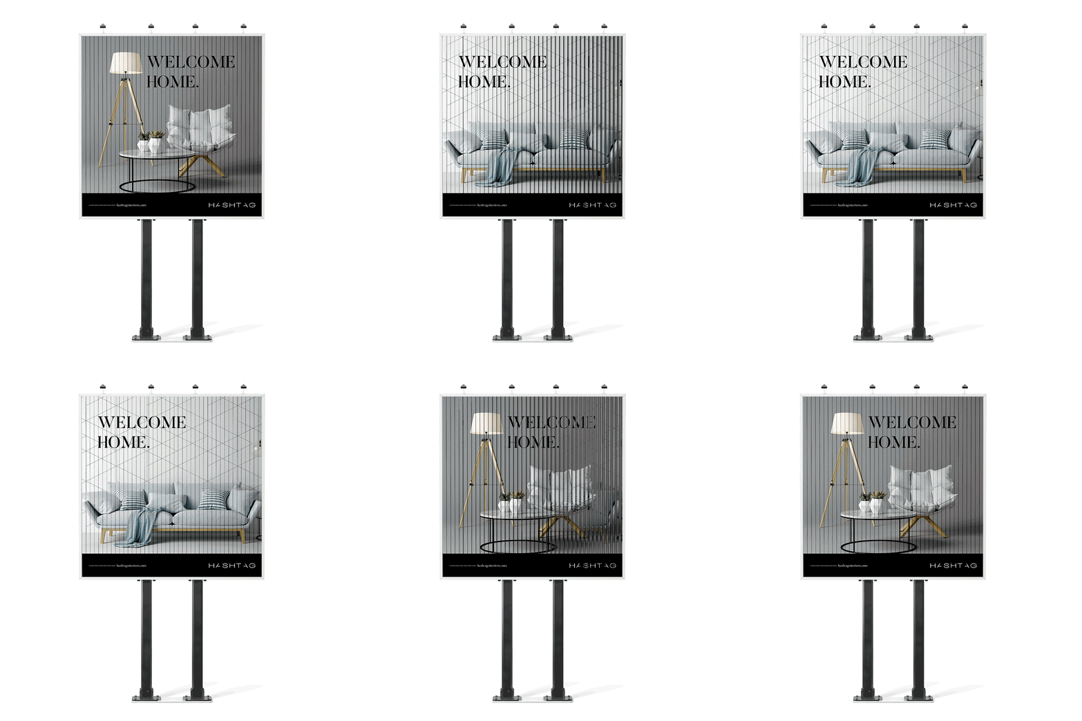
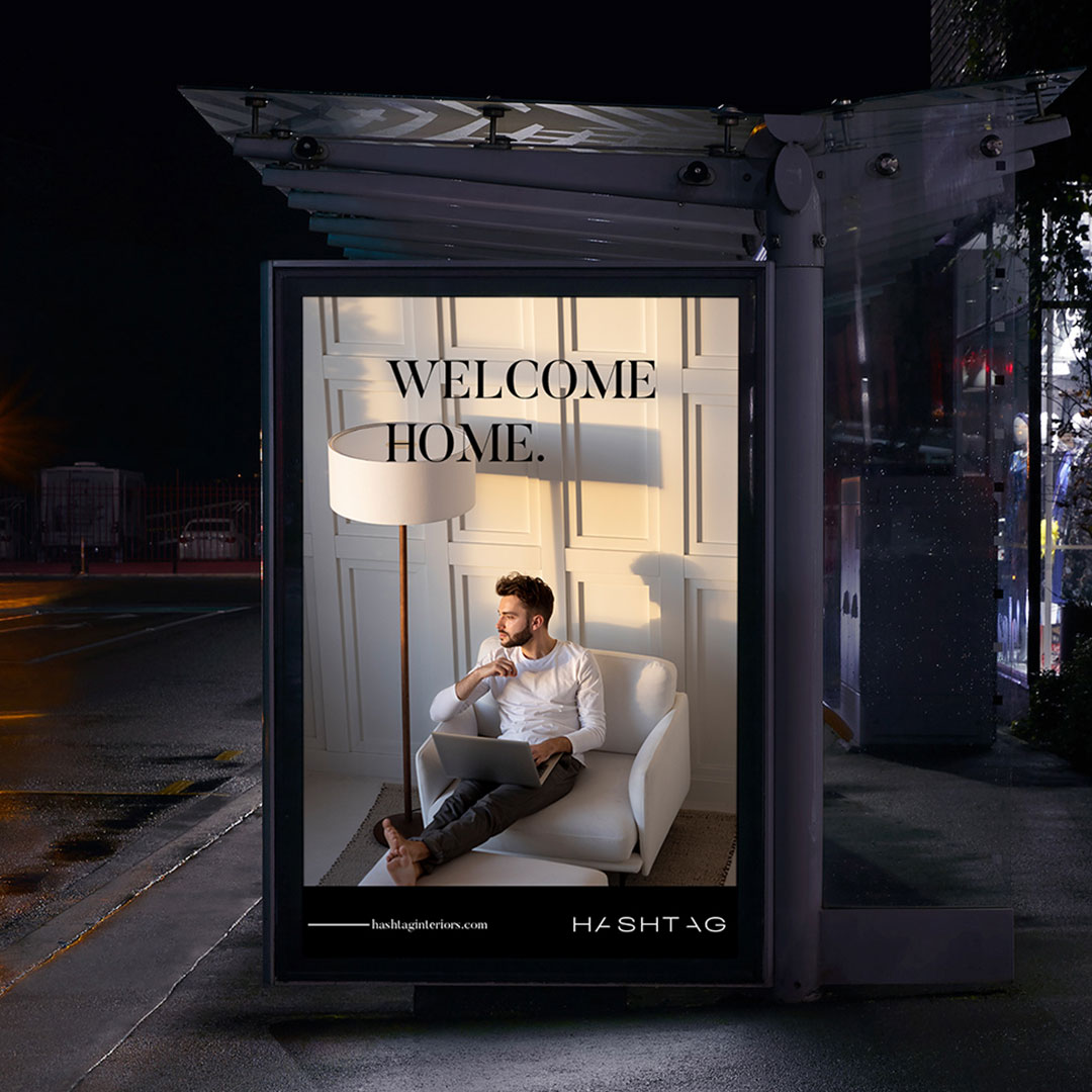
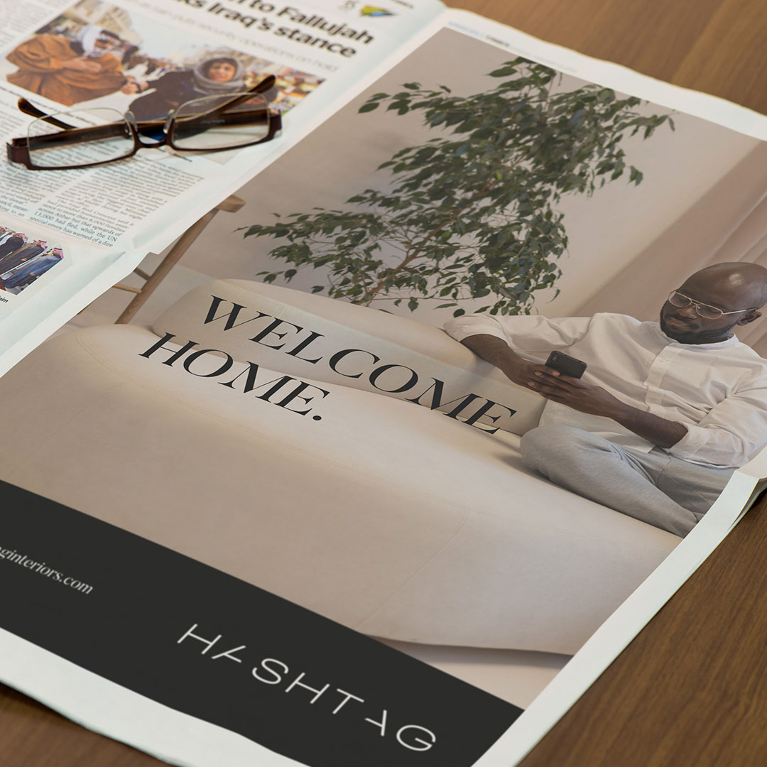
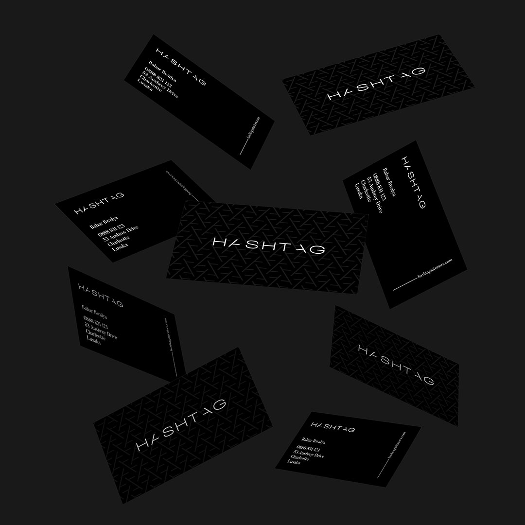
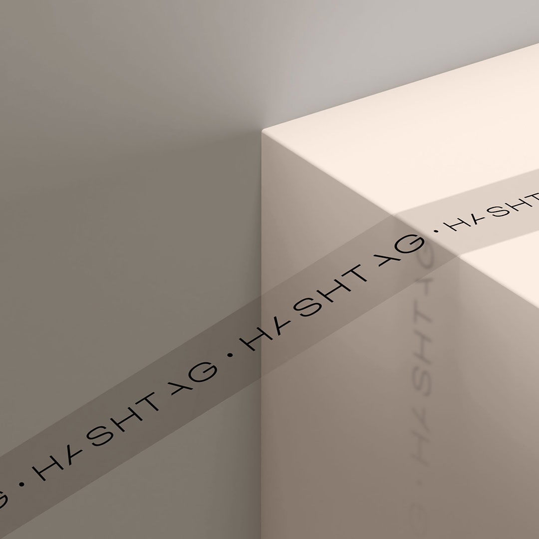
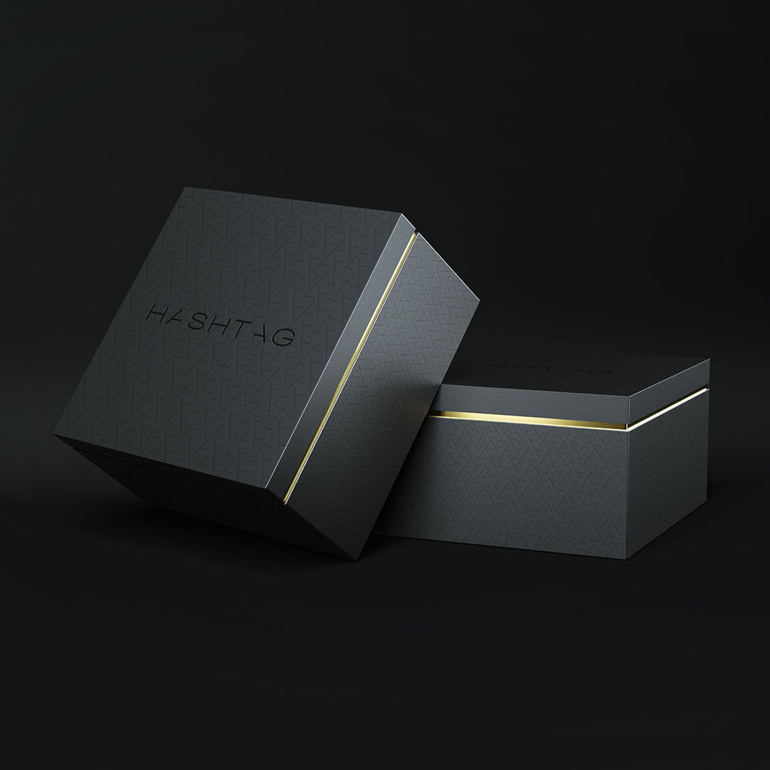
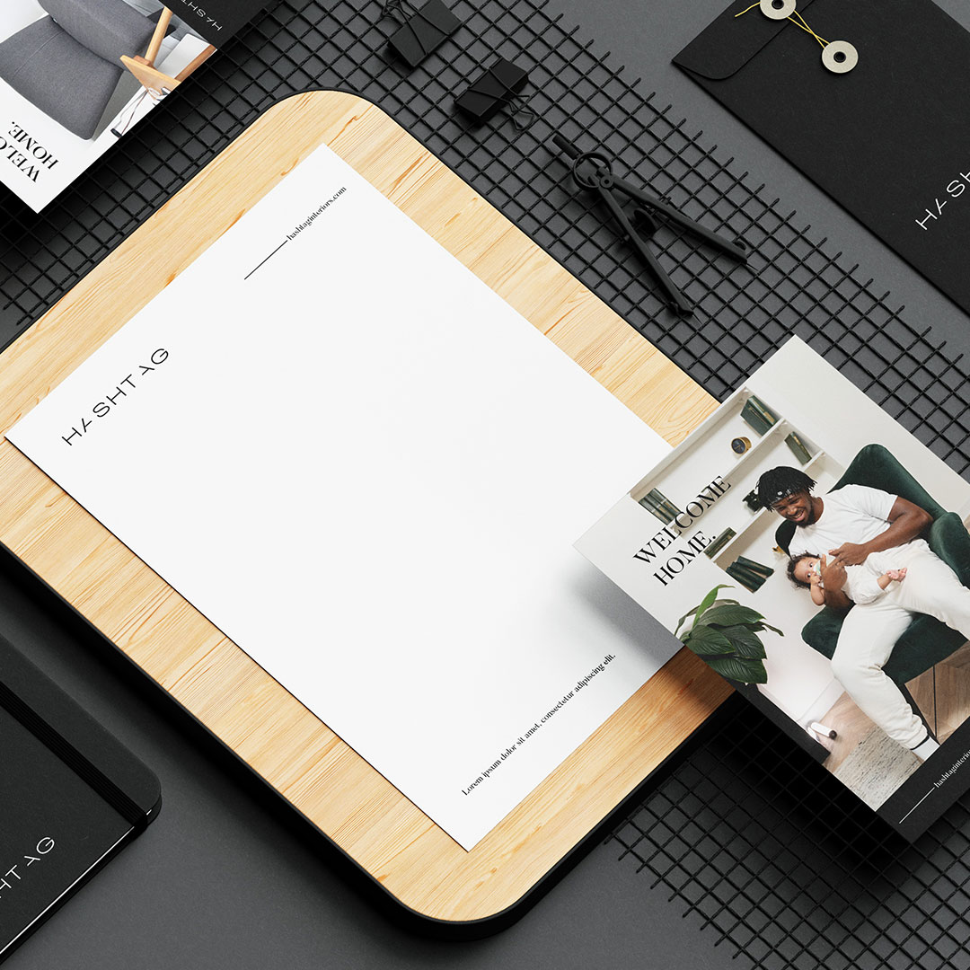
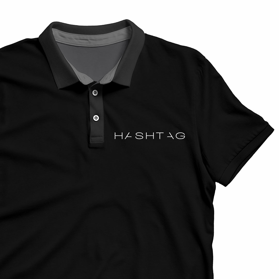
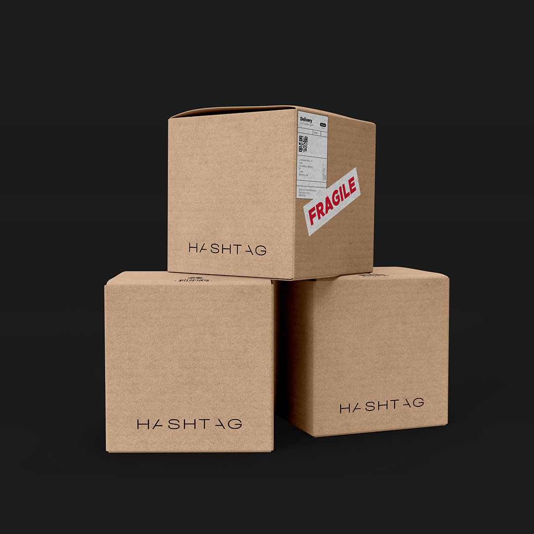
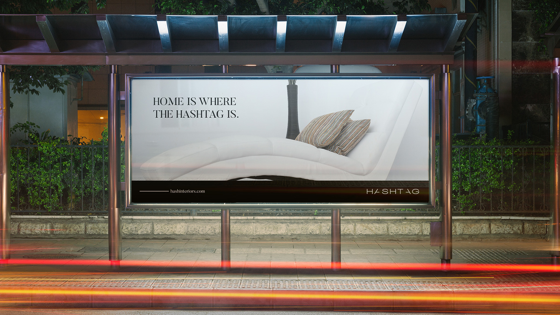
We worked closely with the client to design a beautiful word mark as the anchor of the brand. We chose a thin, wide font to make the word mark look and feel classy. The type choice also mimics the minimalist nature of the brand and the products that it produces. To add a little flair to the word mark we subtracted a side from each of the A’s. This was also a play on the letters to represent the ‘#’ symbol. The color palette of the brand is a simple black, grey and white combination, while the body text is a beautiful serif font. For the advertising elements, we made sure to include a human element, because we wanted to drive home the fact that Hashtag creates human centered products.

Contact
Johannesburg
29 Medlar Road, Randpark Ridge
Johannesburg, South Africa
Harare
33 Cunningham Road, Greendale
Harare, Zimbabwe
hello@stanleyroseagency.com