


Challenge
Being a newcomer in the financial services industry is never easy. Especially in Africa. The nature of this business requires a client to place their financial affairs in the hands of an organization that they may or may not be familiar with. For this reason, players in this industry must be seen as trustworthy, honest and dependable. The challenge for us was to create visual identity that spoke to those attributes despite the company being in its infancy.
The second thing that the client briefed us to communicate through our brand deliverables was that Farm Bank was 100% agriculture focused and primarily a digital first institution. Agriculture and the digital age are not often mentioned in the same sentence, so communicating both concepts within the same brand assets was going to be a challenge.
The last part of this project involved coming up with a deliberate communication strategy that felt at home in the banking industry but was distinct enough to relay Farm Banks message to their clients quickly and without confusion.

Solution
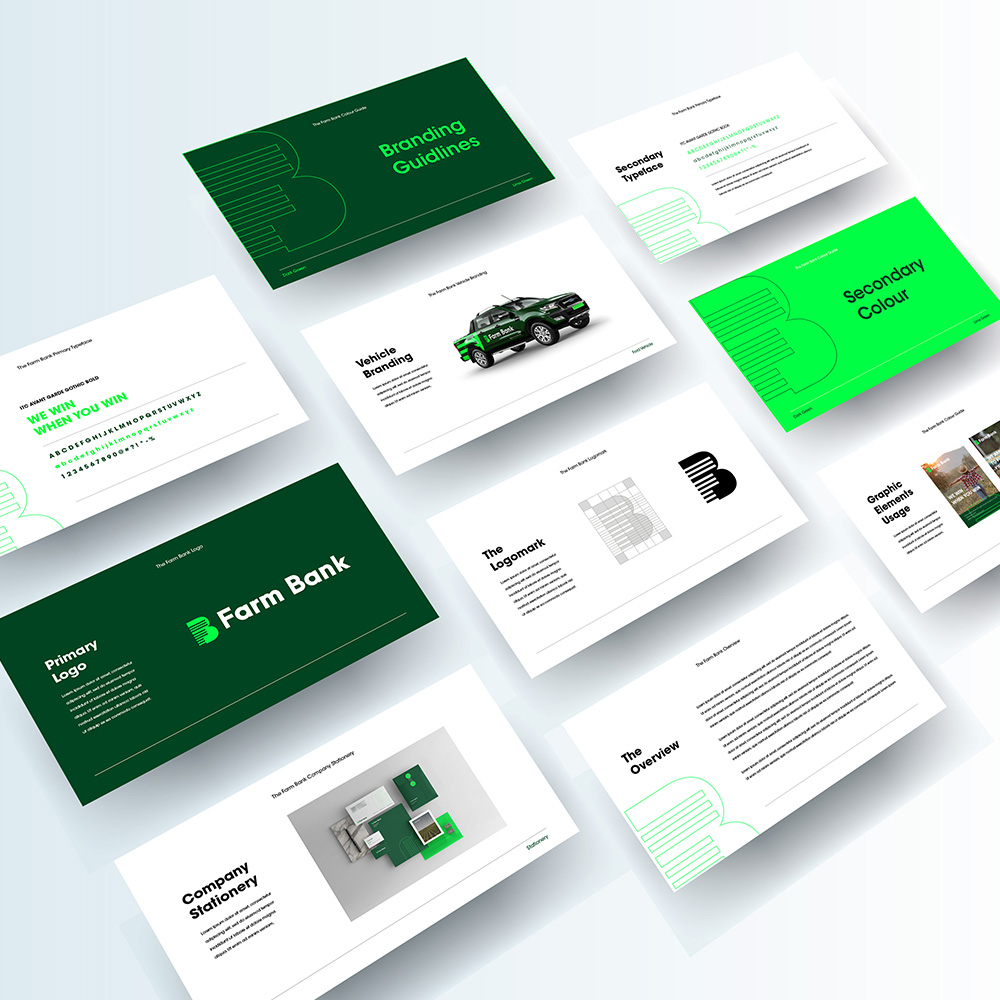
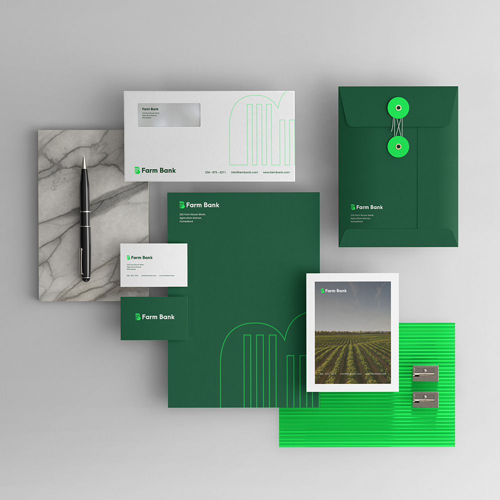
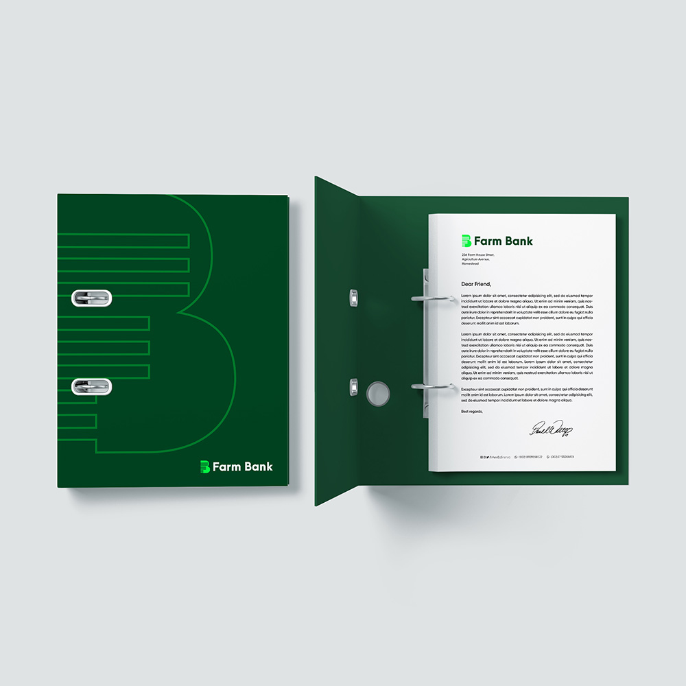
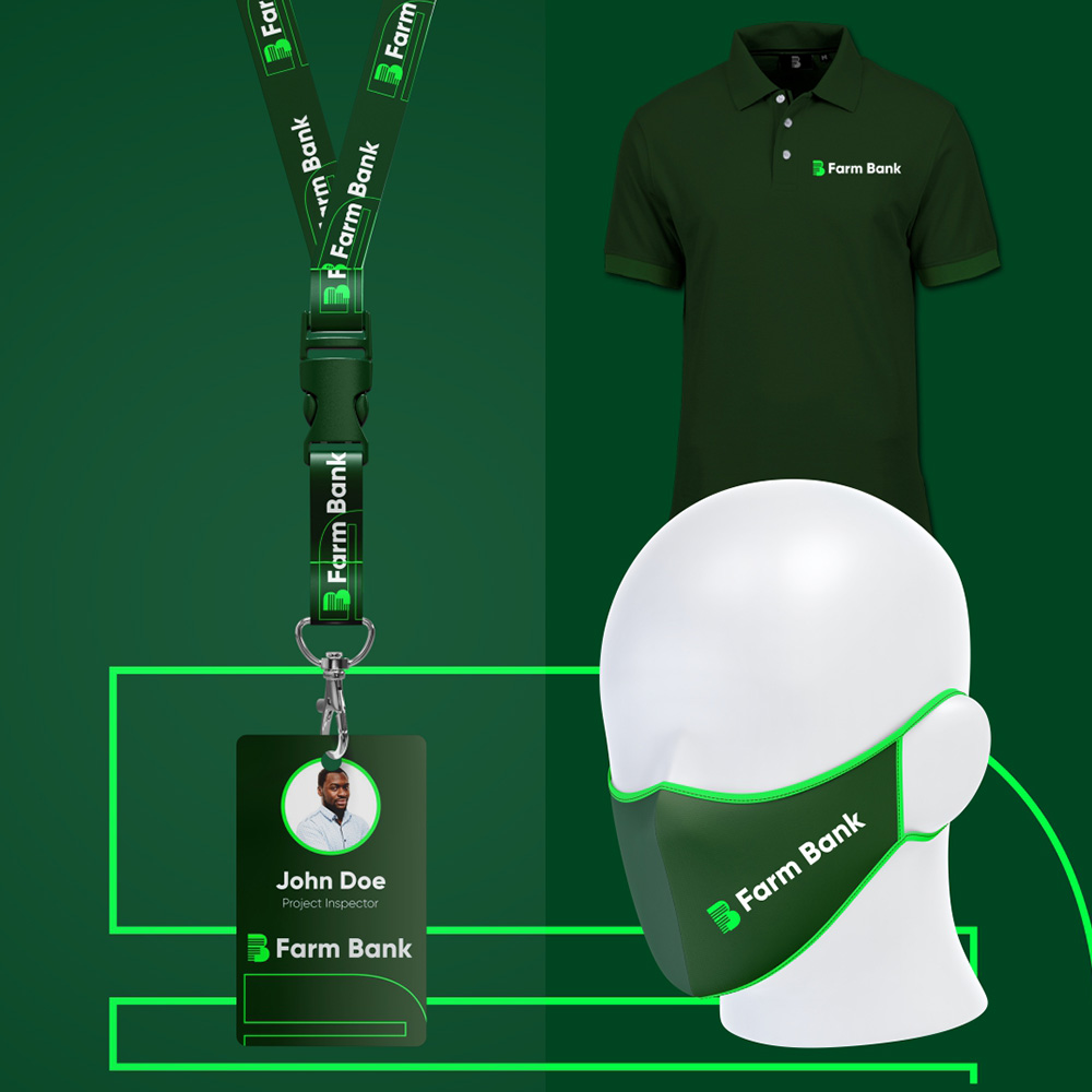
The first thing we did was to anchor the brand in a distinct, recognisable colour palette. For this we chose 2 shades of green. A dark shade that speaks to our clients roots in agriculture and secondly, a lighter (almost neon) shade of green that speaks to the brands youthfulness and digital first approach. This colour palette serves as the main visual cue and differentiator from all other similar institutions.


We then created a bold and recognisable mark by combining the letters F + B with the F being drawn in a way that simultaneously represents a wifi signal and crop lines. The B plays the role of the land which serves as the backdrop of the marriage between digital and agriculture. The logo is rounded off with a nice bold sans serif font that gives it a very sturdy and trust worthy feel.

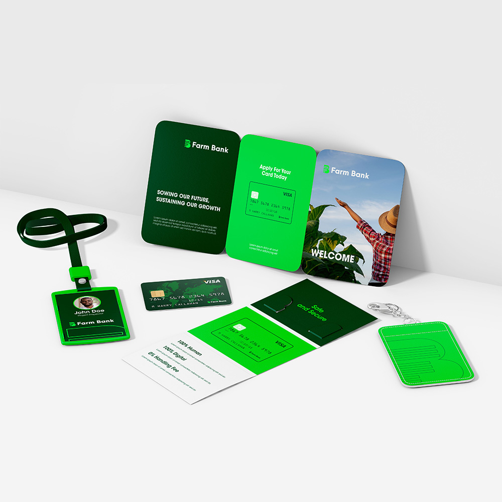
With regards to our communication strategy, we made sure that we kept the copy very short and very bold. We did our best to sell the company’s brand promise and vision in as little words as possible, also making use of simple language. Further to that, we let images do most of the talking. Our image choices were clear and refreshing. They also managed to strike the right balance between being aspirational and relatable.


Contact
Johannesburg
29 Medlar Road, Randpark Ridge
Johannesburg, South Africa
Harare
33 Cunningham Road, Greendale
Harare, Zimbabwe
hello@stanleyroseagency.com