




Challenge
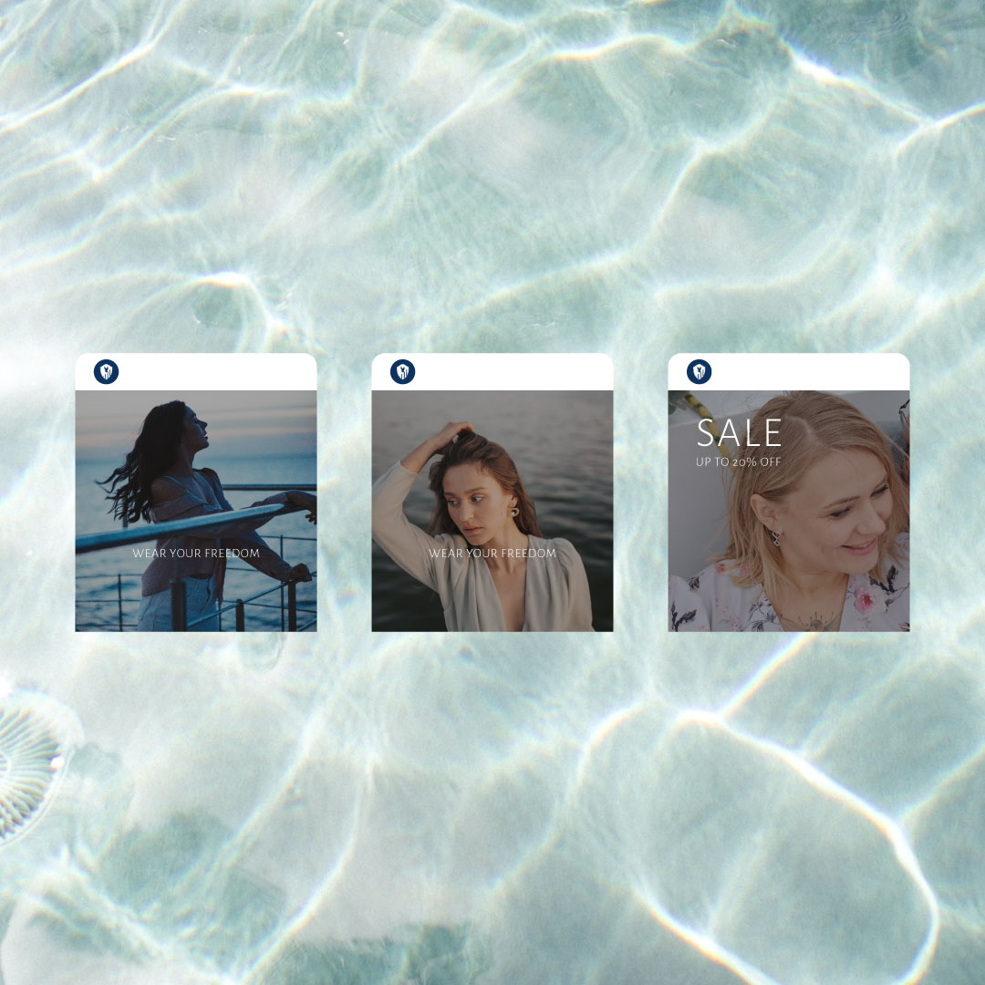
Bucks County Earring Co.‘s target market is adventurous, upper middle class women between the ages of 25 and 35. They wanted us to help them create a visual identity that effortlessly captured the imagination of that demographic. It was also important to them that we capture the boating culture found within Bucks County in the various touch points that we create. The final solution also had to have a premium feel to it, in line with the brands business goals.

Solution
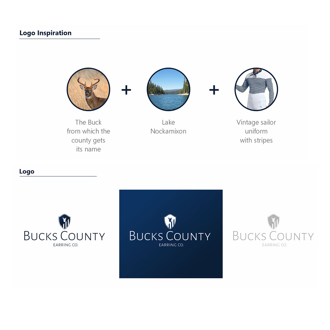
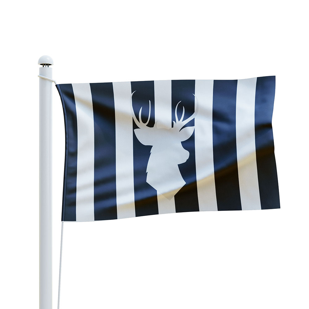
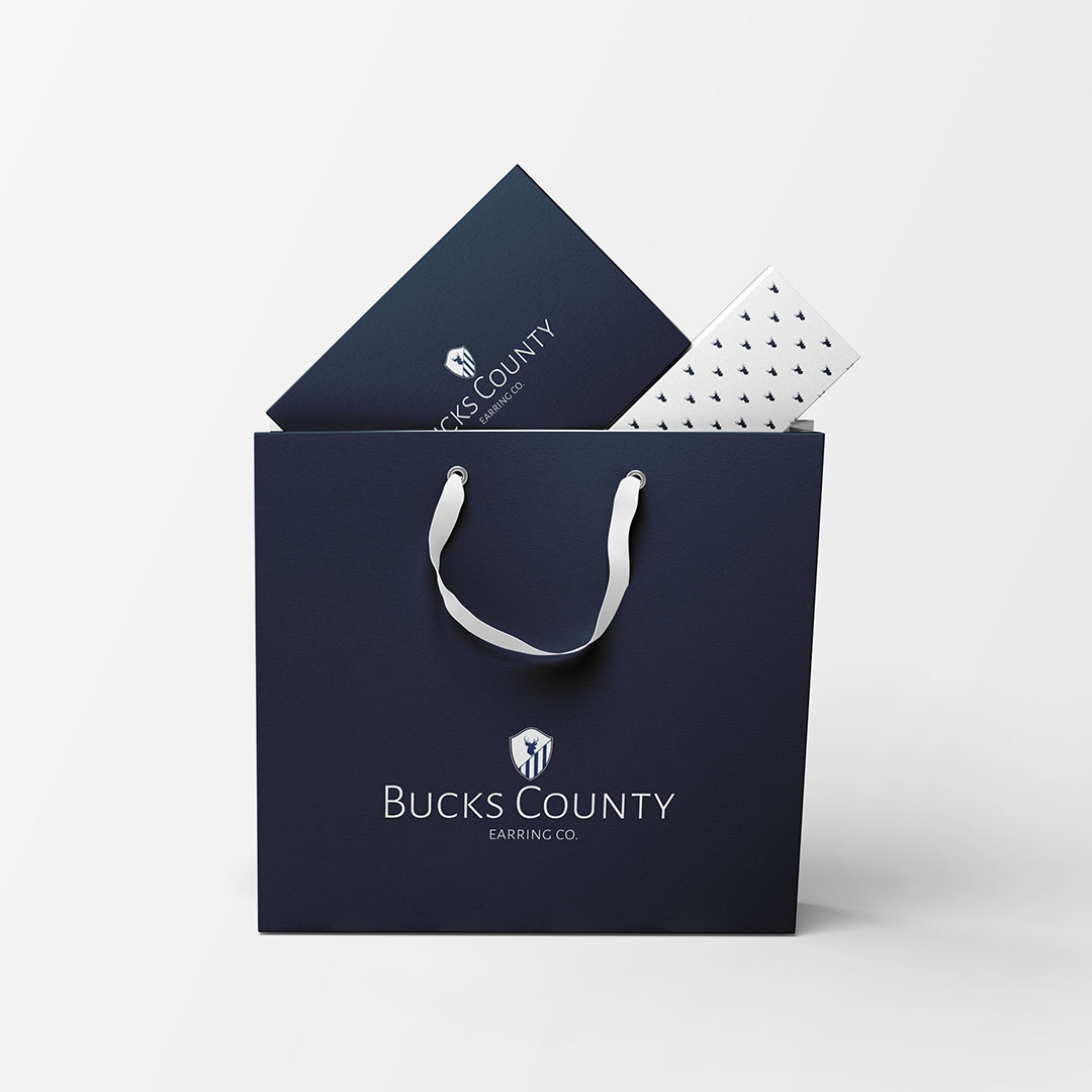
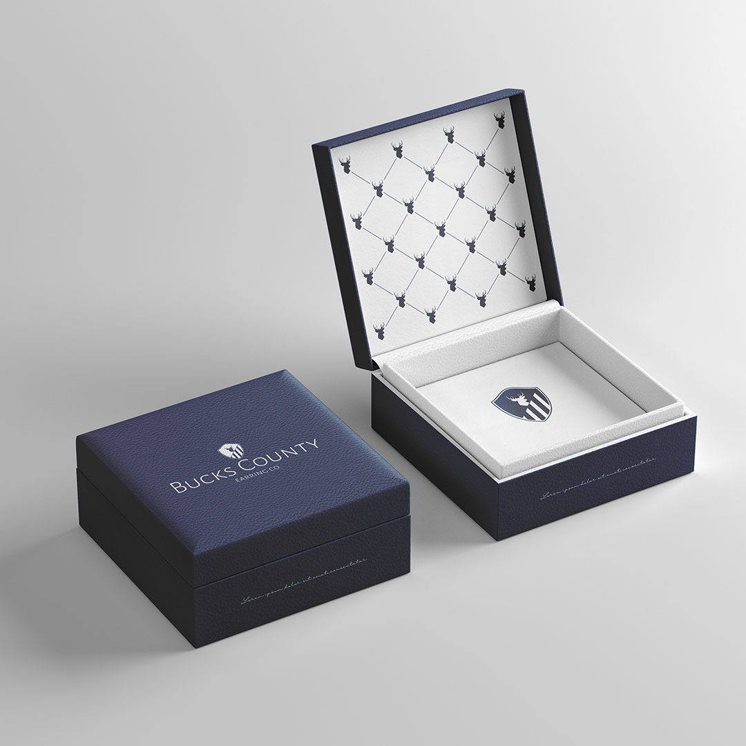
To begin with, we created a beautiful mark by combining a buck and nautical stripes within a round edged shield. This combination fully embodies the company’s roots, derived from their location. We felt that this was a very strong visual that immediately commands attention on any medium that it is encountered. from their location.
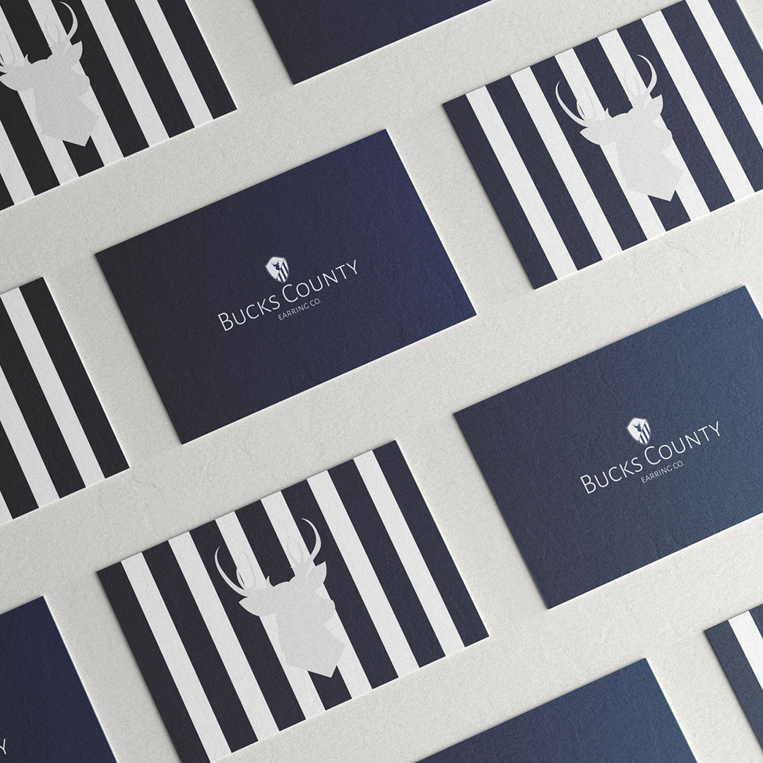
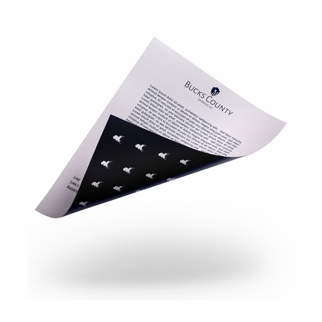
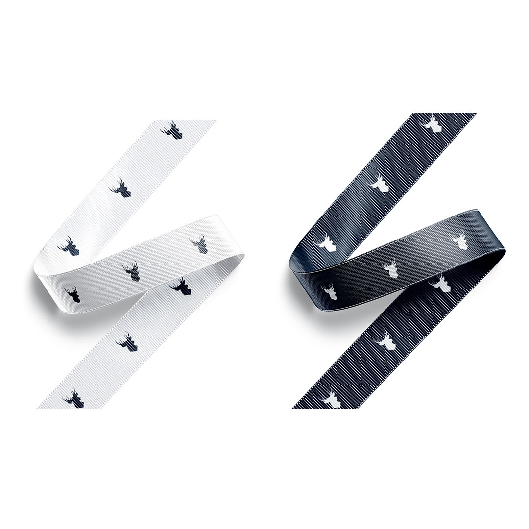
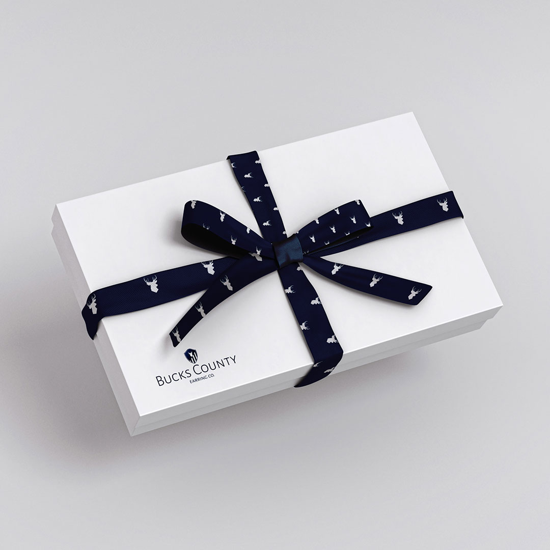
We chose blue and white as the color palette because it fell seamlessly into the nautical theme of the brand. Navy blue is also a very luxurious color that works well with any premium brand. Our font choice was a clean and simple san serif option that brought the right level of sophistication to the brand. Lastly we created a beautiful seamless pattern from the logo elements that would be used on the various pieces that would make up the packaging.



Contact
Johannesburg
29 Medlar Road, Randpark Ridge
Johannesburg, South Africa
Harare
33 Cunningham Road, Greendale
Harare, Zimbabwe
hello@stanleyroseagency.com