


Challenge
We worked closely with the client to identify what key points our aesthetic had to meet. We agreed that the final brand touch points had to be sophisticated and luxurious, while striking a balance between being warm yet striking. We also knew that we had to approach this rebrand with a minimalist mindset because less is definitely more.




Solution
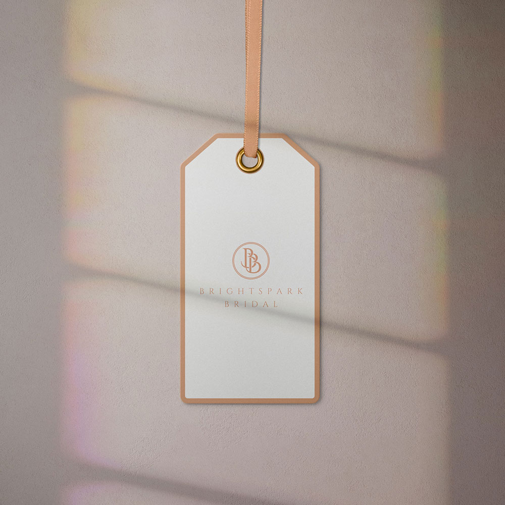
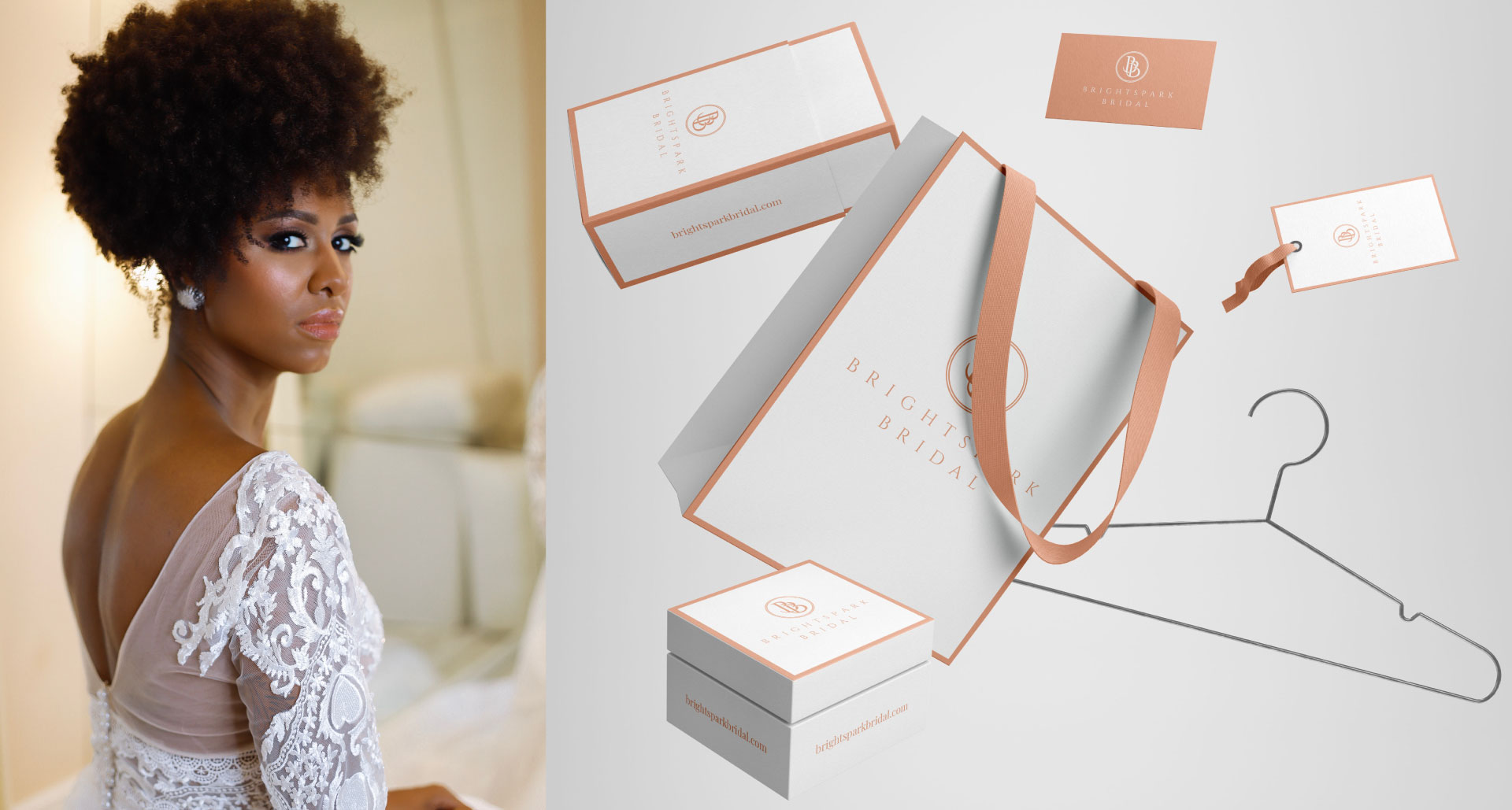
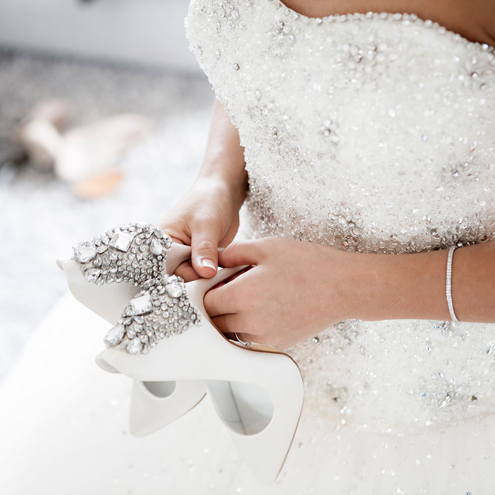
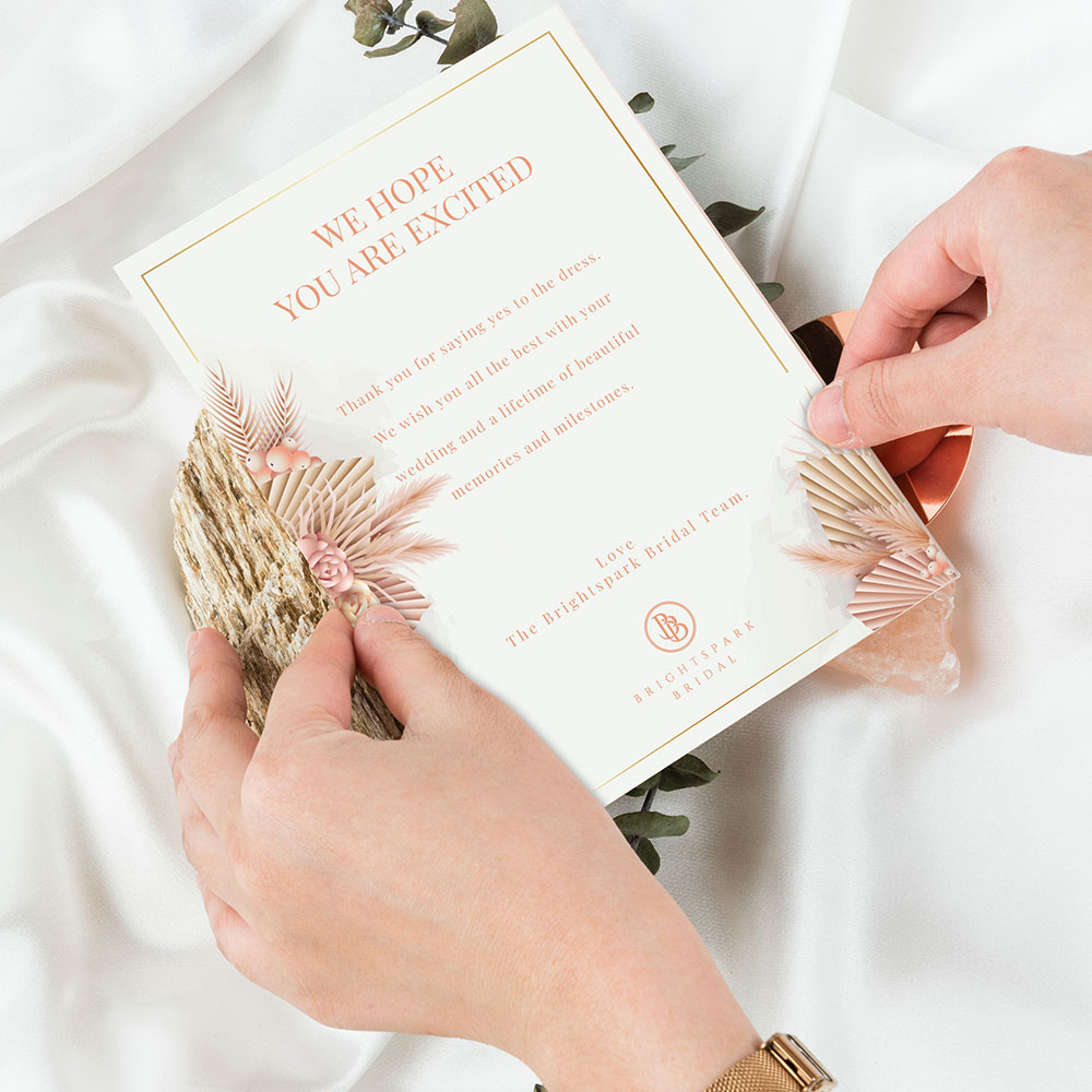
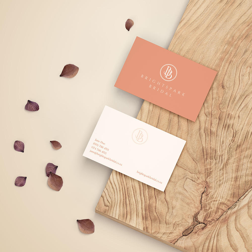
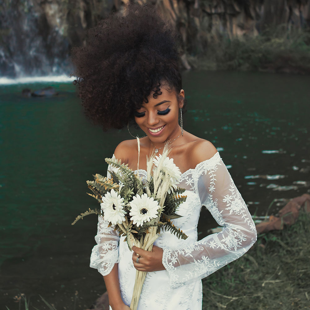
We used a subdued peach/corel color scheme to create a soft, almost dreamlike aesthetic that perfectly complements the light tones frequently used at weddings.
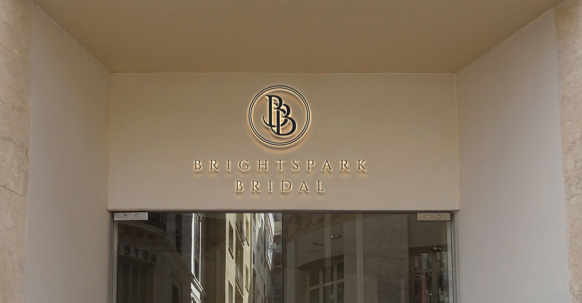
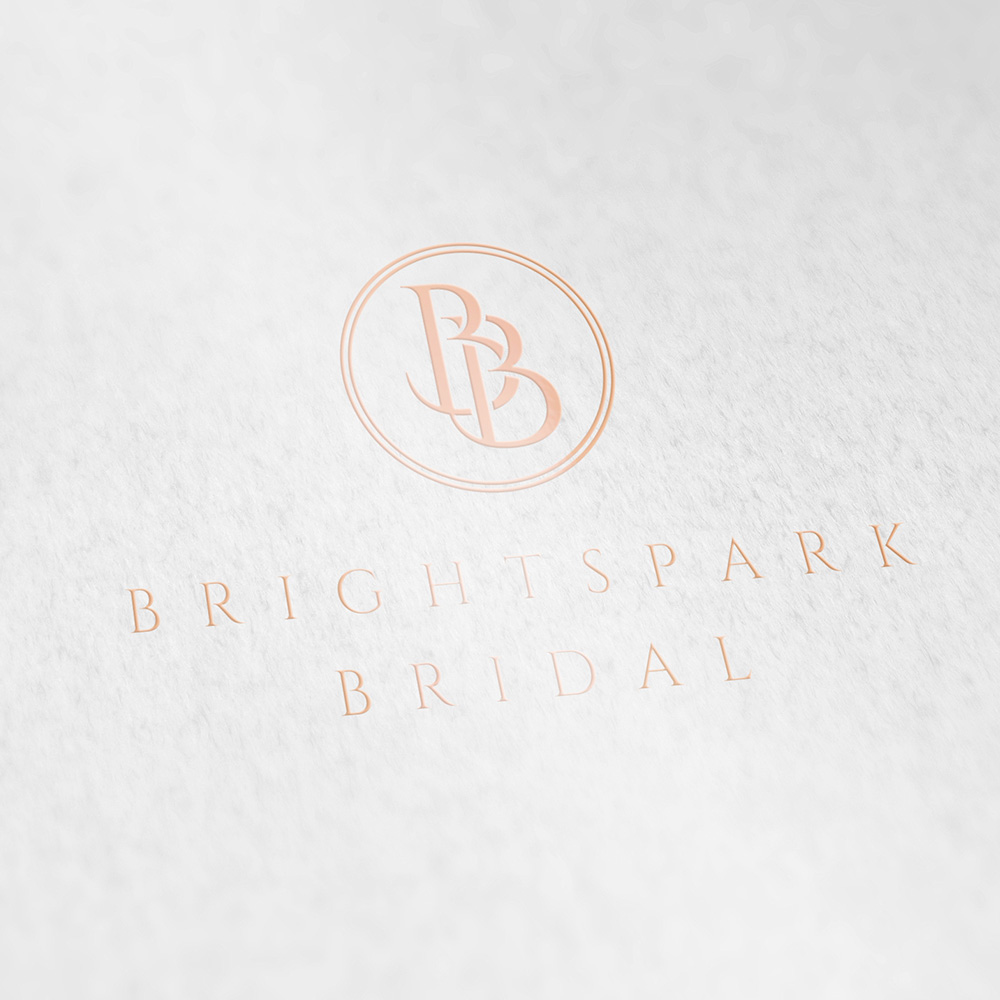
We then created a striking logo mark by combining 2 B’s to create a simple and elegant intertwined monogram. We then enveloped the monogram in 2 rings that represent a couple’s wedding bands and union.The brand was then perfectly positioned as a high-end fashion boutique thanks to the lovely serif font we selected.

Contact
Johannesburg
29 Medlar Road, Randpark Ridge
Johannesburg, South Africa
Harare
33 Cunningham Road, Greendale
Harare, Zimbabwe
hello@stanleyroseagency.com