*Please note that this was not an actual commissioned project. It was developed as a concept and should be treated as such.



Air Zimbabwe is the country’s flagship carrier. It was founded in 1967 and is wholly owned by the Zimbabwe government. In the past couple of years, it has had its fair share of well documented problems. Naturally public perception around their brand has suffered as a result of this. As an agency we decided to use our talents to re-imagine what the brand could be in the future and set out a number of objectives for ourselves in this regard.


Challenge
The first thing we had to do was to create a brief for ourselves and then execute it. We decided on the following key targets.
- To visually position Air Zimbabwe as a world class, luxury, legacy carrier.
- To visually pronounce that the airline is moving in a new direction in a way that inspires and breeds trust.
- To acknowledge the airlines history
- To create a visual identity that stands out and will be instantly recognisable upon sight.
- To reflect Zimbabwe’s heritage and identity within the designs.


Solution
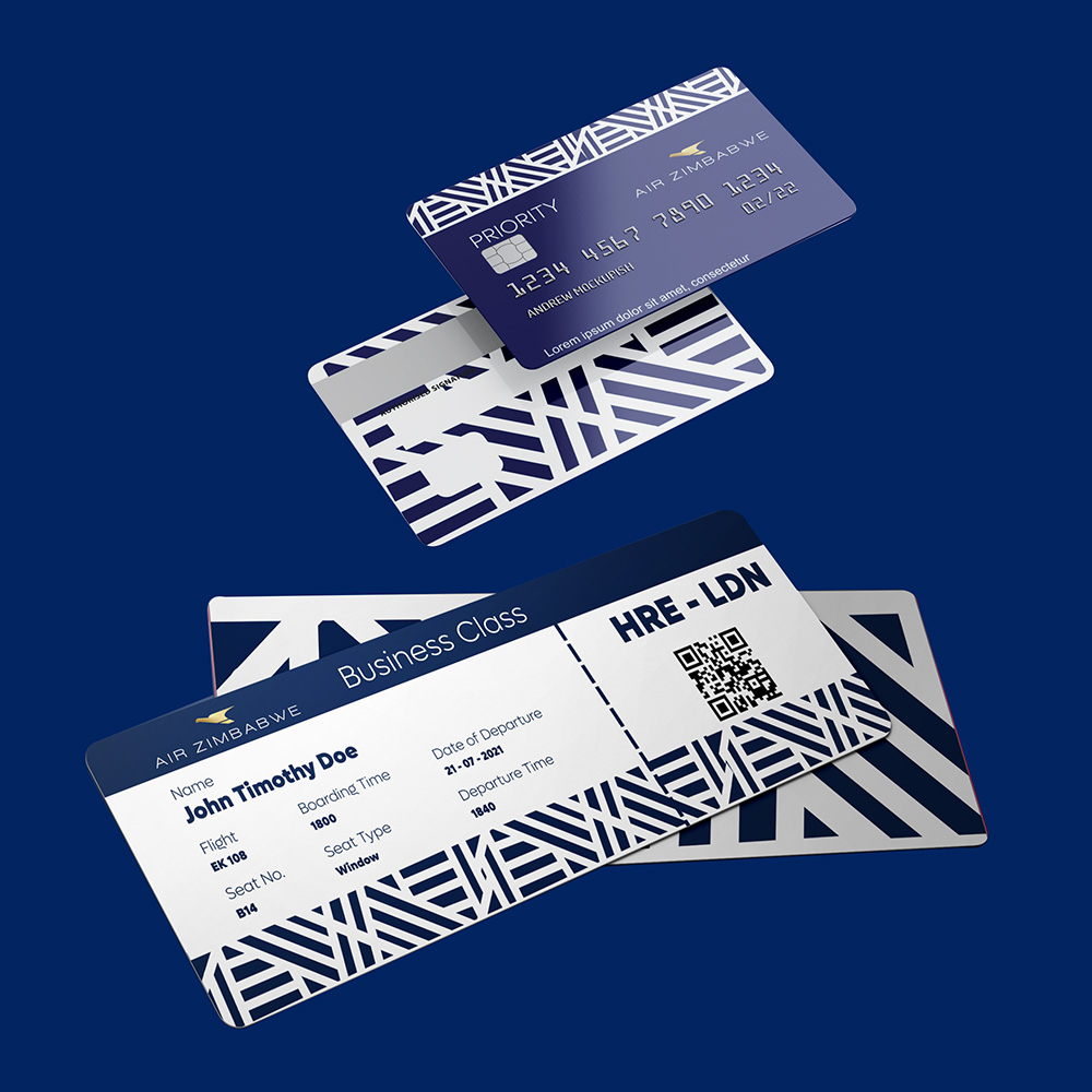
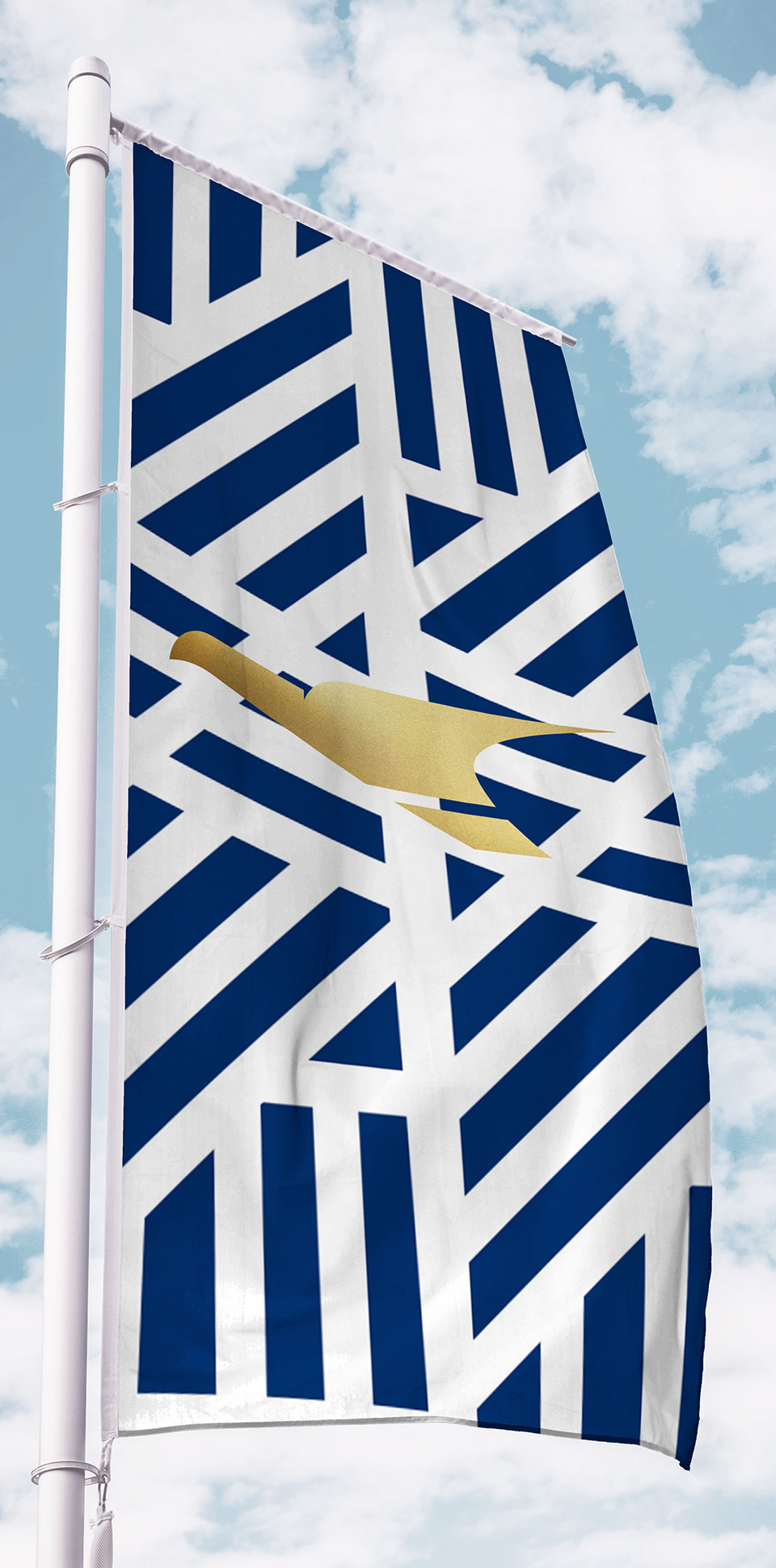
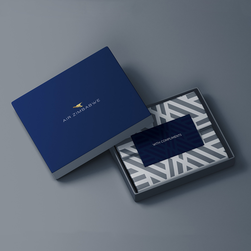
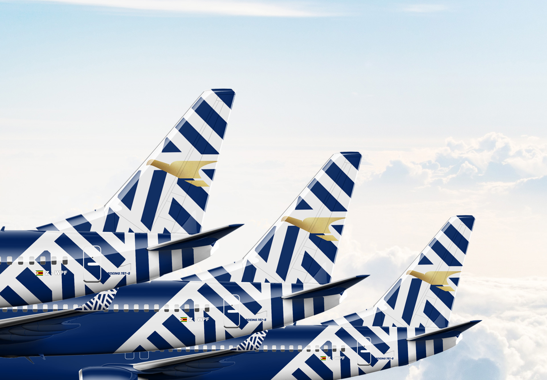
For the brand mark, we decided to modify the existing bird. We sharpened the edges and added a gold finish to it. For the font choice, we went with a light sans serif option. These changes brought the logo lockup from dated to elegant sophistication.
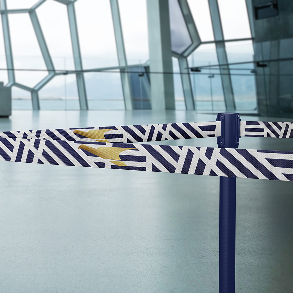
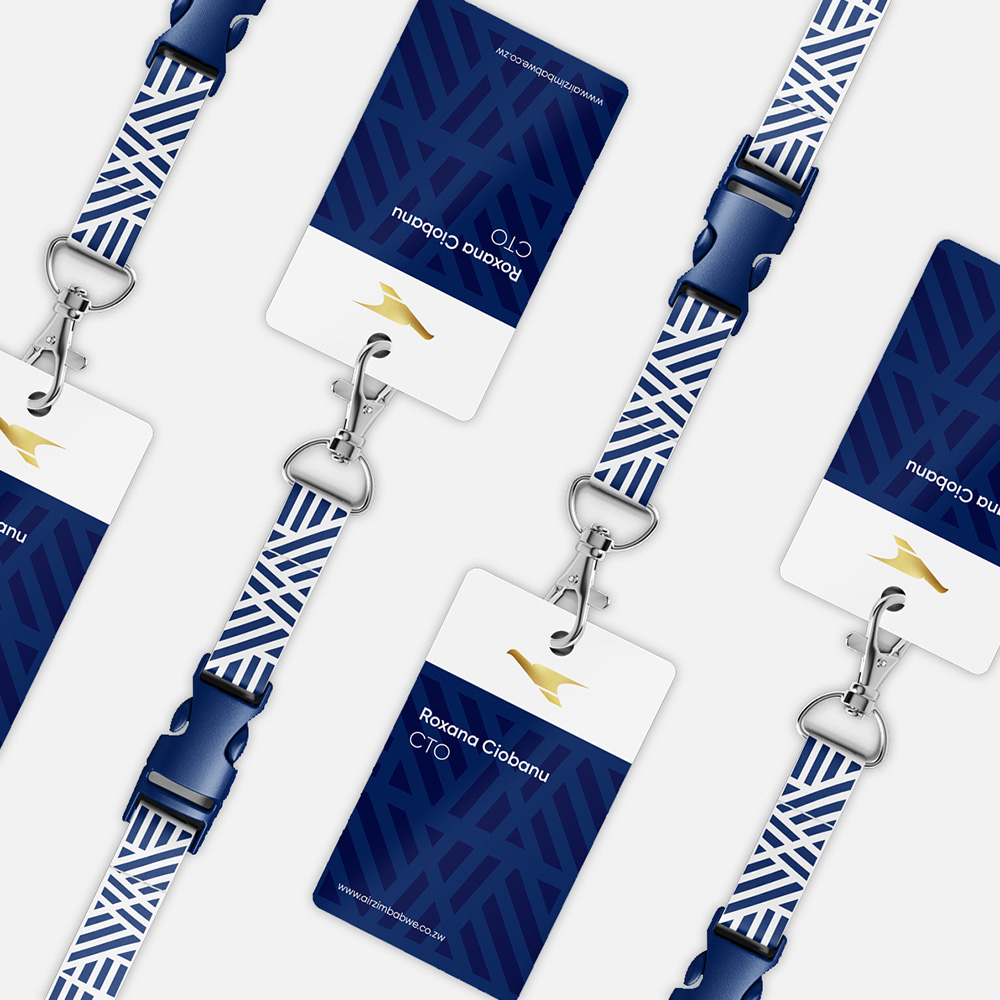
Without a doubt the crown jewel of this rebrand was the creation of the pattern that flows seamlessly through the various touch points. The inspiration for this motif was a combination of the chevron design found at the beautiful Great Zimbabwe ruins and the stripes found on our flag. From the airplanes livery to the amenity kits and stationary, this show stopping pattern adds African beauty to every brand touch point it is placed on.
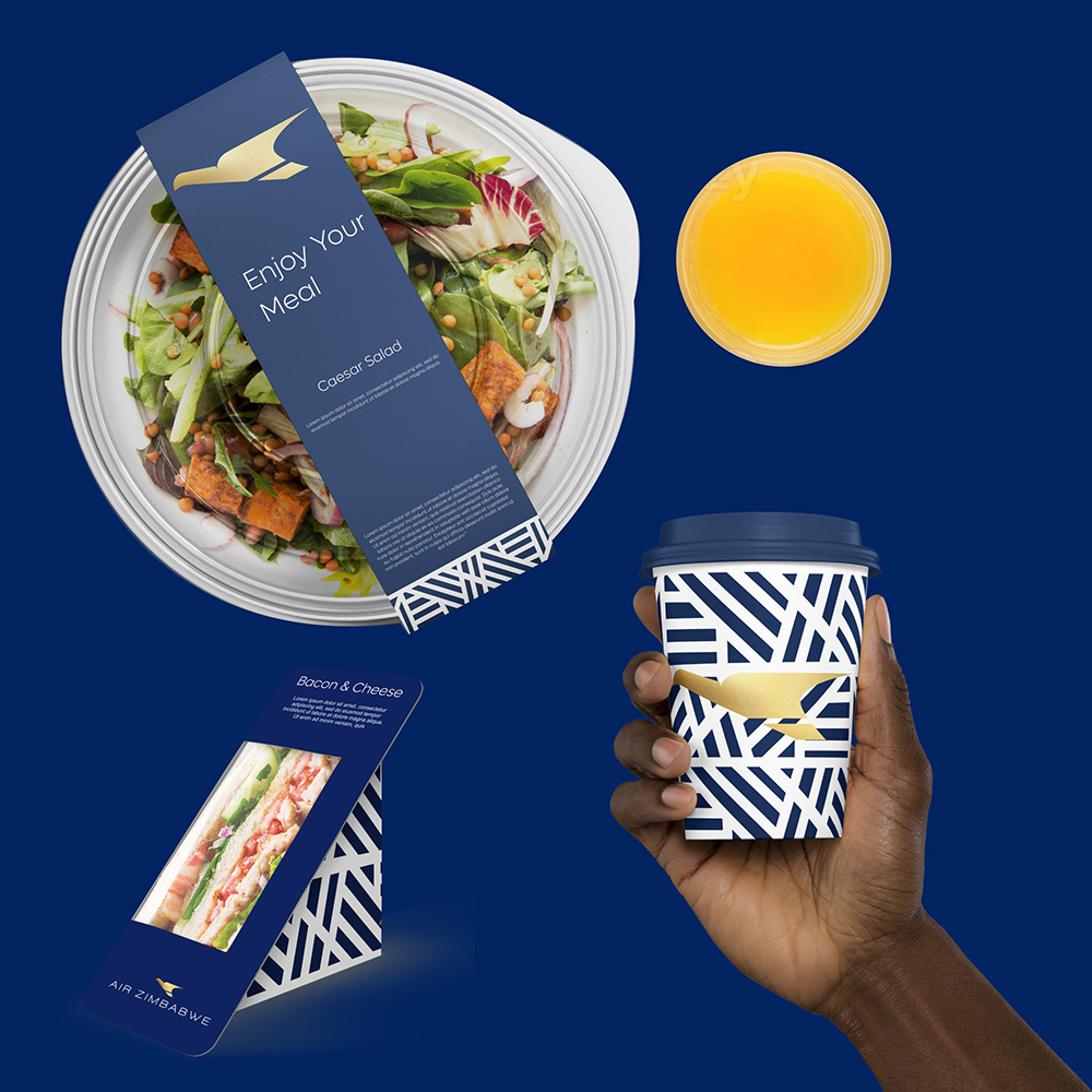

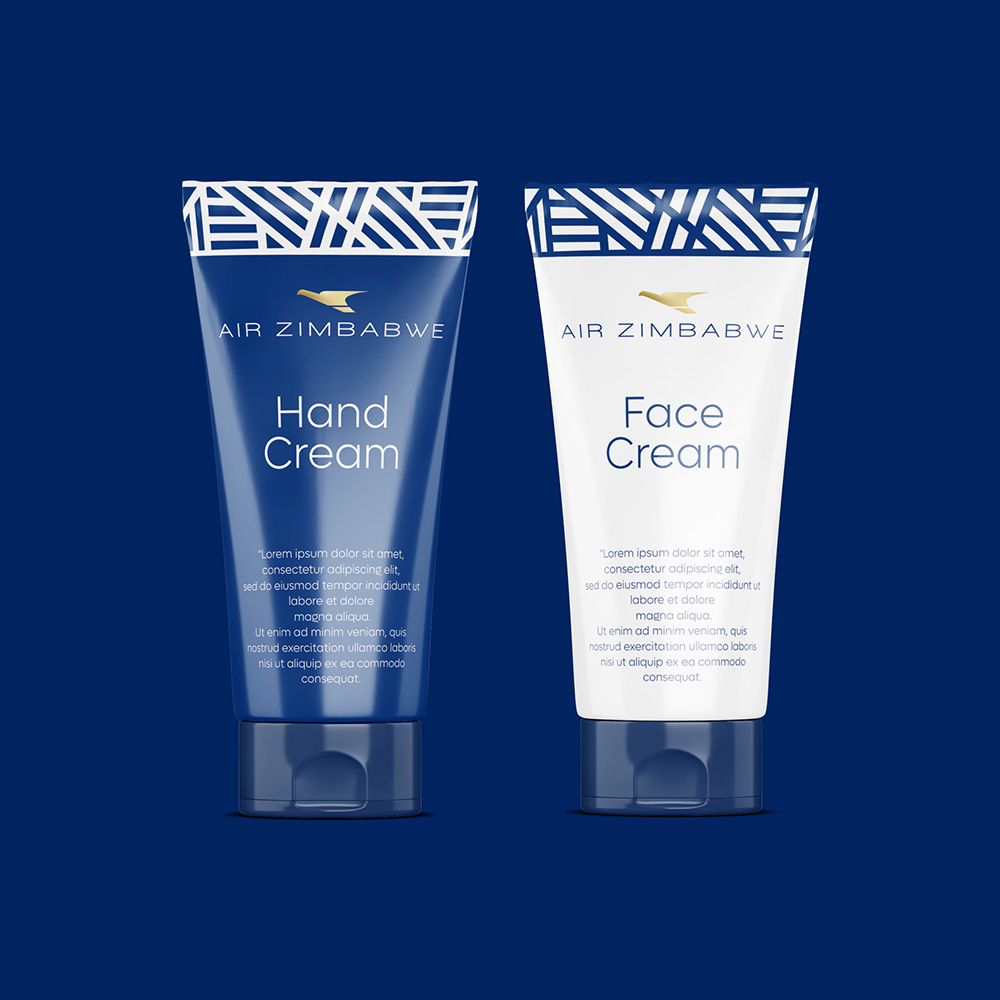
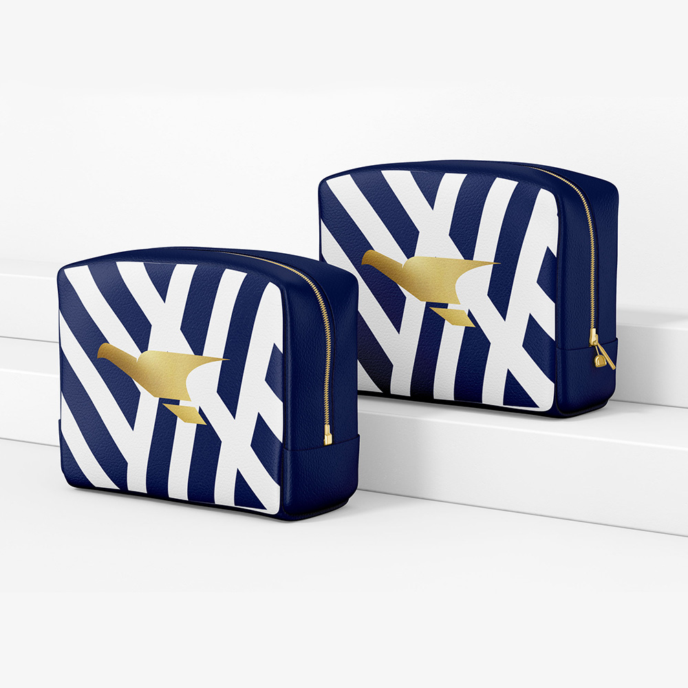
We wanted to position Air Zimbabwe as a modern luxury legacy carrier operating in the midst of low cost, budget peers. In order to do this, we chose a deep royal blue as the base colour for the brand. This colour exudes class and opulence and would carry our message of luxury across.
Furthermore, the traditional colours of red, yellow and green are the corporate colours for at least 4 rival airlines that operate in the region making a departure from this colourway ideal. The total departure from the previous brand colours also clearly points to a new era in the airline’s evolution.
Contact
Johannesburg
29 Medlar Road, Randpark Ridge
Johannesburg, South Africa
Harare
33 Cunningham Road, Greendale
Harare, Zimbabwe
hello@stanleyroseagency.com